Oceanview Publishing 📘
Finding books faster — improving search by nearly 4x to improve usability and drive conversions for a boutique mystery publisher
📝 Summary: After solving the mystery of falling bulk sales, our team overhauled the navigation, flow, and visual look of the website to address our primary users’ needs and frustrations. We also updated the backend CMS to help editors easier update and maintain the site.
🎉 Results: Oceanview’s new website succeeded far beyond our expectations:
Title search 🔎 time improved by 384%
Book sale 📈 conversions rose by more than 50% after 3 months, and
Editorial staff found the website far easier to update 🖥️ and maintain
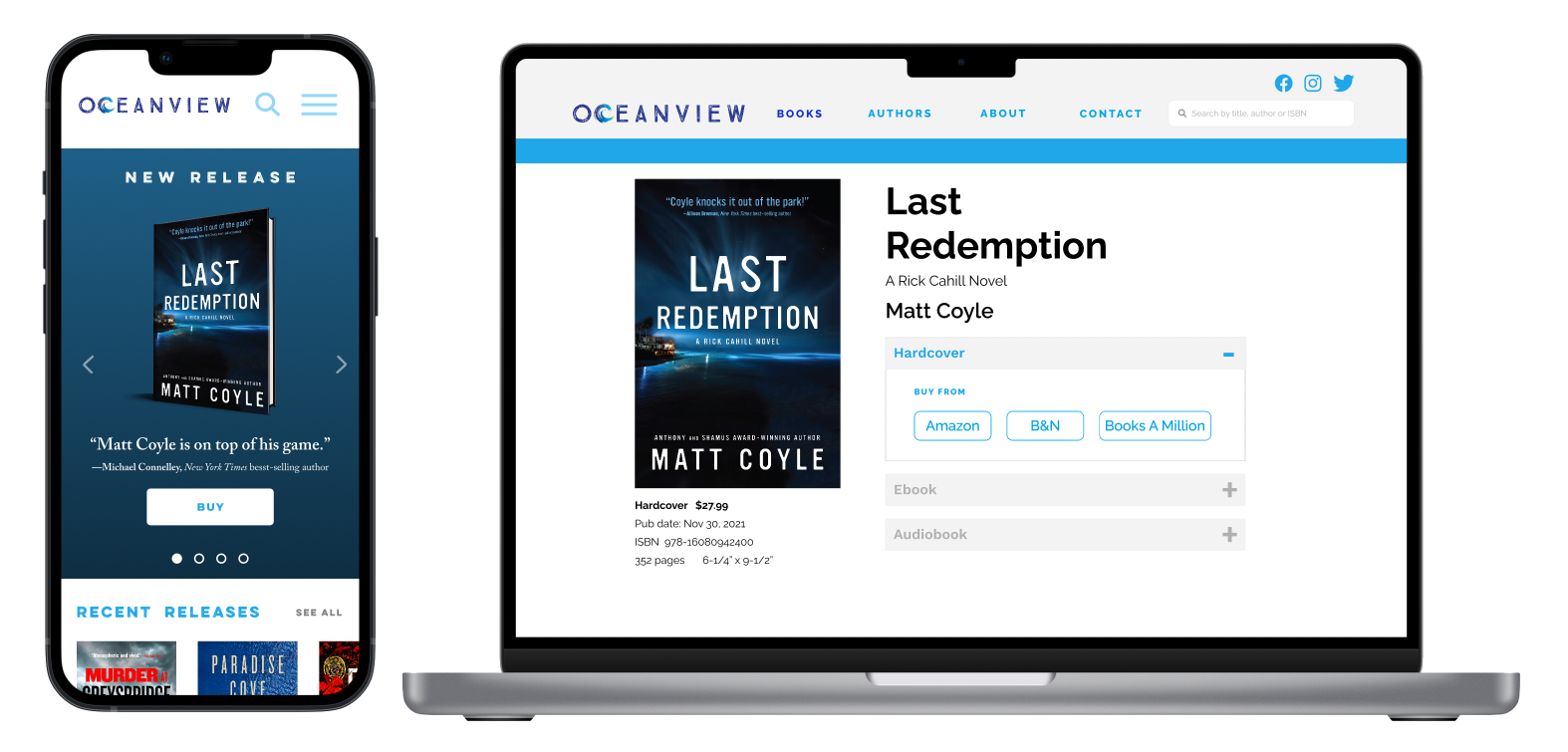
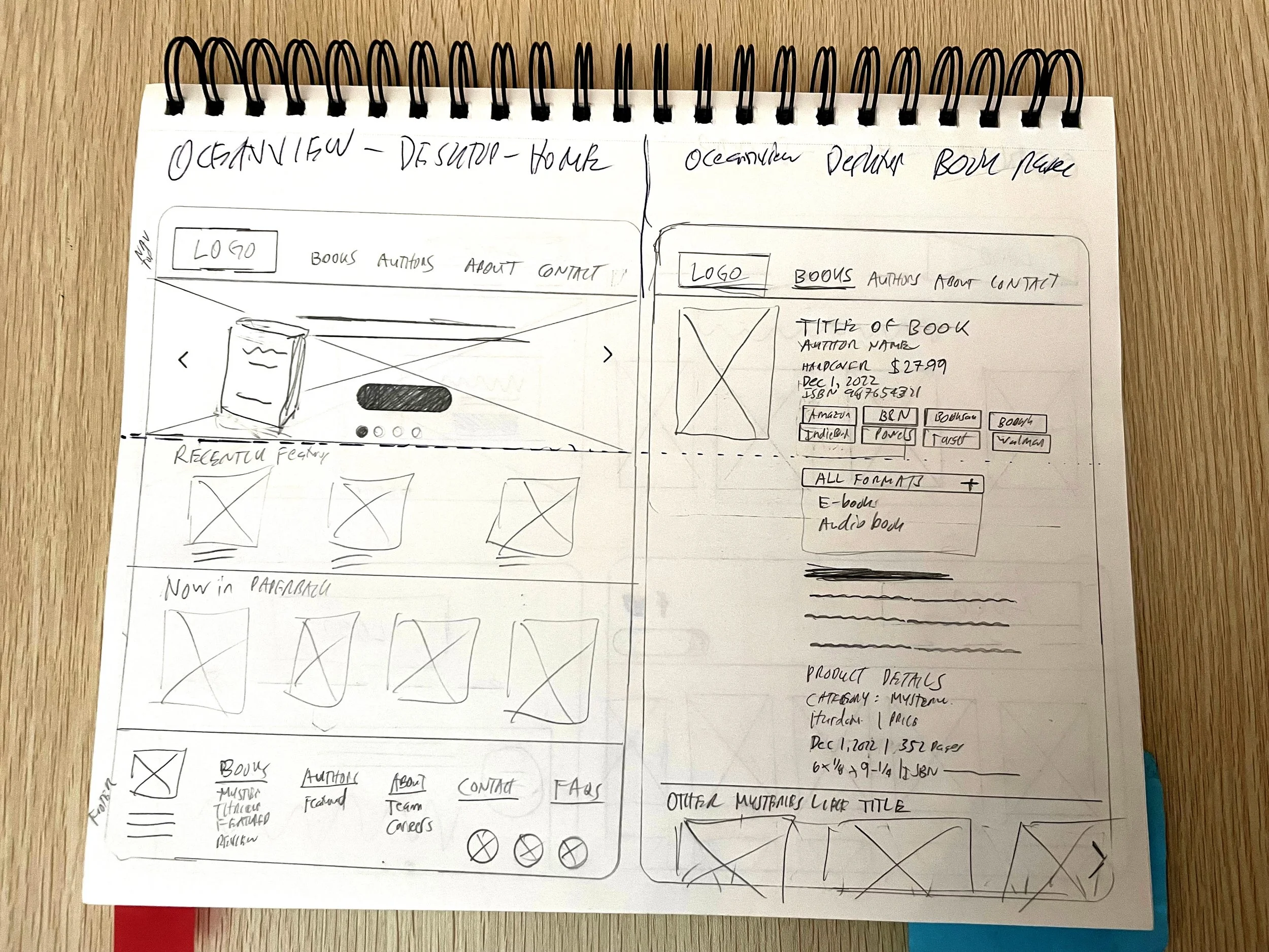
Oceanview Publishing website (desktop)
Here's how we did it. . .
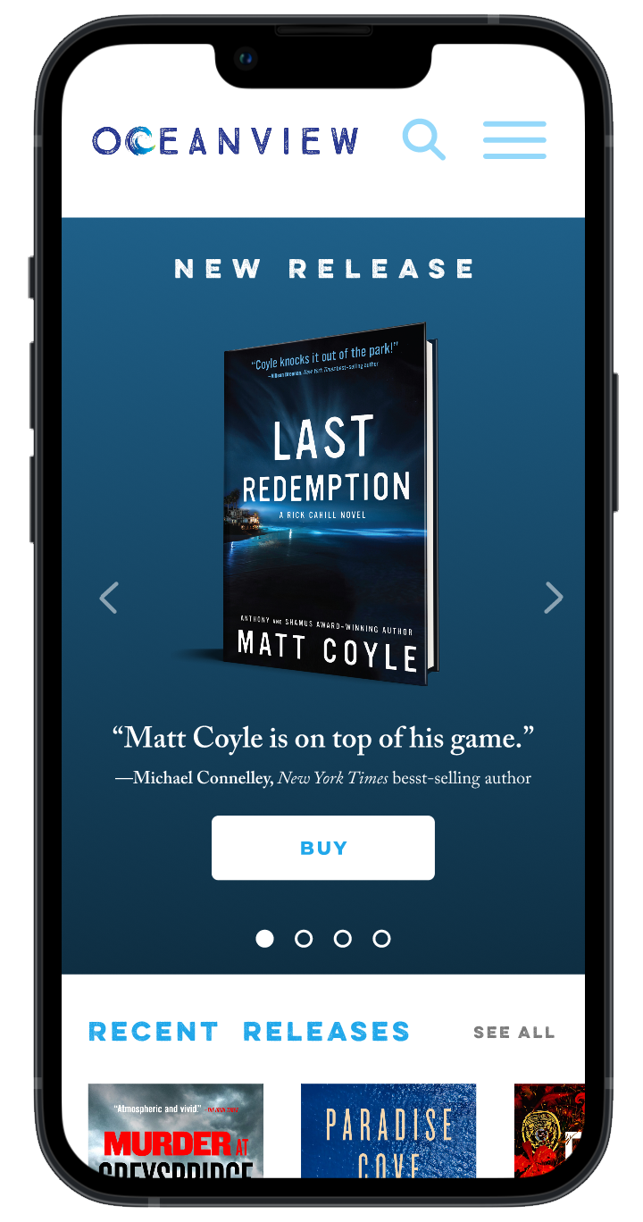

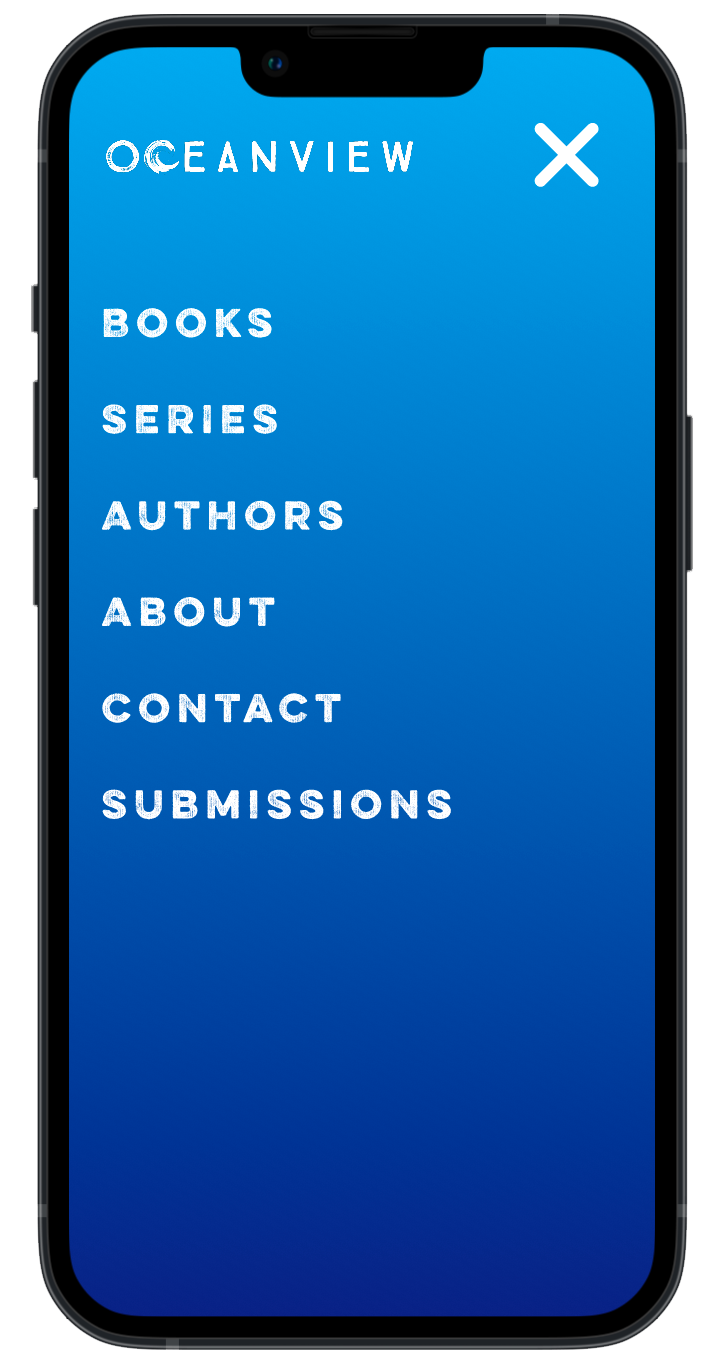
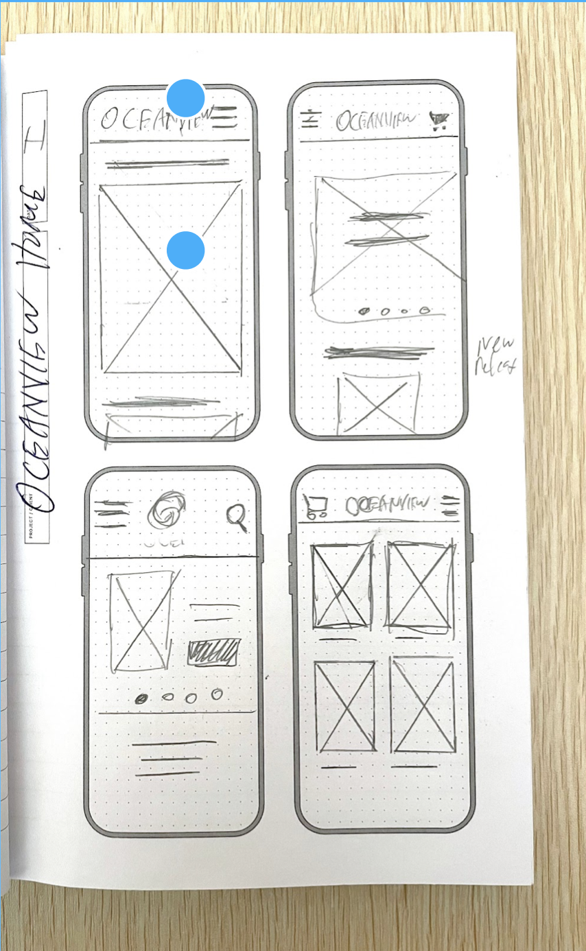
Final designs (mobile)
Sales down, complaints up
Oceanview Publishing is a boutique press based in Sarasota, Florida, that specializes in mysteries and thrillers. After several years of creating covers for them as a freelance, I joined the staff as Art Director. One of the first things I did was institute A/B testing of cover designs, which improved sales.
However, despite this, the press was starting to see two concerning trends:
Decreasing sales to wholesalers and libraries and
Regular complaints from authors and agents about the dated look of the website, which they felt reflected poorly on them.
There hadn’t been significant updates in almost a decade, so I pitched the idea of conducting a user-centric design process to redesign Oceanview’s site. At the time I was learning UX in my spare time but with scant product design experience under my belt.
Project roles
I led the product design and research of the project from discovery through its entire lifecycle. My varied roles included UX designer, UX researcher, interaction designer, and visual designer. I collaborated with a cross-functional team consisting of leadership, editorial, marketing, SEO, and a Webflow developer.
Goals — Improve experience, sales, and look
Our user and business goals in the redesign were three-fold:
1. Improve the experience for users and staff
Navigation was difficult and hard to use for users
Update and maintenance were laborious for staff — using a “wonky” WordPress system, they had developed complicated workarounds just to do simple updates
2. Increase sales with bulk buyers
The majority of Oceanview’s sales came from wholesalers and libraries — the website itself was not a main driver of e-commerce.
We needed to better engage bulk buyers in new titles and help them find our backlist.
3. Visually refresh the site to attract new authors
Authors and agents complained Oceanview’s site was visually cluttered and did not represent them in their best light.
Calls for a brand refresh to establish a clean, contemporary look.

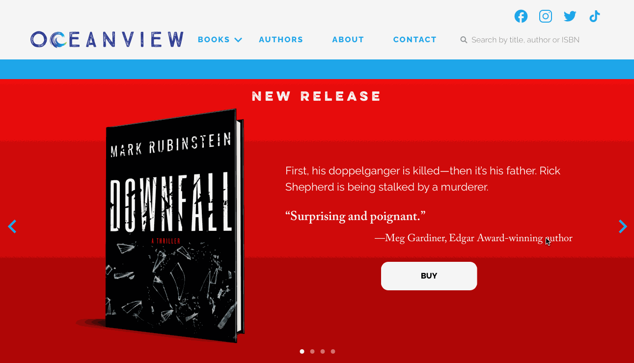
Oceanview’s original home page
Discovering real site users and what they really need
We thought we knew who the publisher’s website was for — readers, right? But our initial assumption proved wrong.
After conducting a series of interviews and surveys with a host of stakeholders — staff, book buyers, distributors, librarians, agents, authors, marketers, and readers — and analyzing site metrics, we determined who our real core users were. And it wasn’t readers.
🔥 Discovery Insights
Bulk sales book buyers and librarians were the principal and most important website users
Agents and prospective authors were important secondary users
Exploring challenges facing librarians and agents
From anecdotal evidence, we already knew some of the frustrations agents and authors had, but we needed to get a better sense of the problems facing bulk sales buyers.
Building on our initial research, we created two personas to help us understand user needs and frustrations.
📚 Lydia the Librarian — our primary user was an acquisitions librarian, who had limited time each week to find and purchase new books for her library, using her desktop computer.
📱 Andrew the Agent — our secondary persona was a literary agent who needed to check the site on his mobile phone for updated title information.
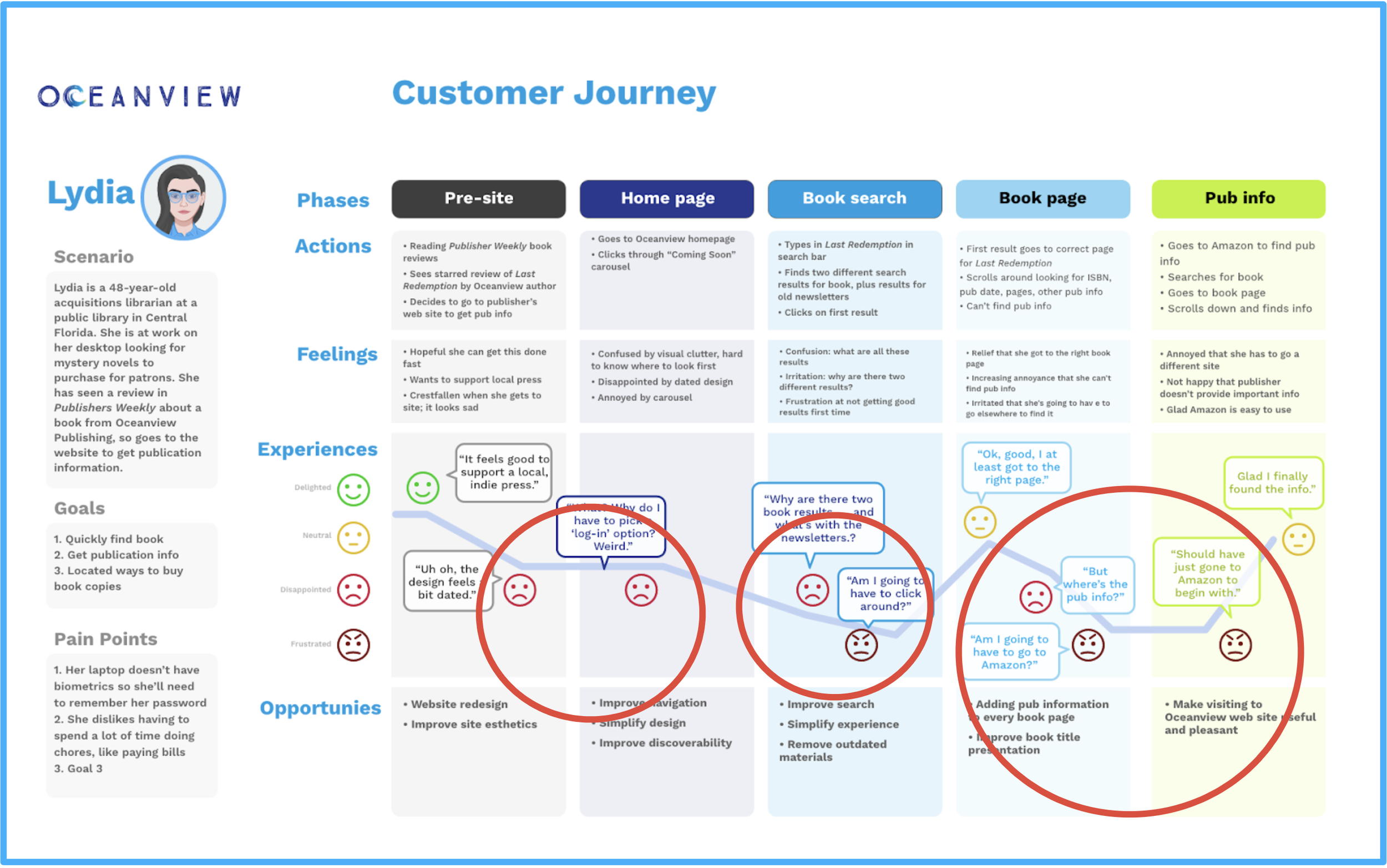
Key Insight — can’t find basic info
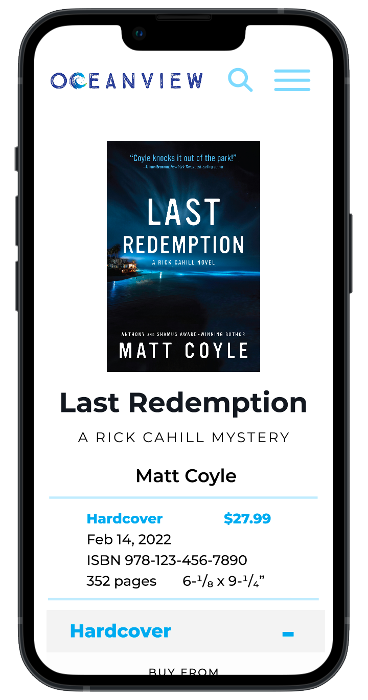
Mapping our librarian’s journey, the key insight we discovered was that she could not easily find basic, important information on the site’s book pages, like ISBNs and publication dates in order to make bulk purchases.
⚠️ In fact, most librarians said they frequently had to leave Oceanview’s site and go to Amazon or Barnes & Noble to find basic publication information on Oceanview books.

Before — A typical book title page. No publishing information (e.g. ISBN, pub date) is available.
Adding ISBN info — a huge, little change
🔥 This one simple, insight — that librarians couldn’t find basic pub info on book pages — proved to be the key to the success entire project.
Like with the $300 million button, what we needed to change in the design was small. . . but crucial. We didn’t fully realize this until we tested with users.
All the remaining changes — simplifying search and navigation, updating the visual look and feel — were important but did not have the impact of just making a few changes to the book template page.
Without realizing we had a quick fix to our core problem, we set about to tackle a confusing interface.
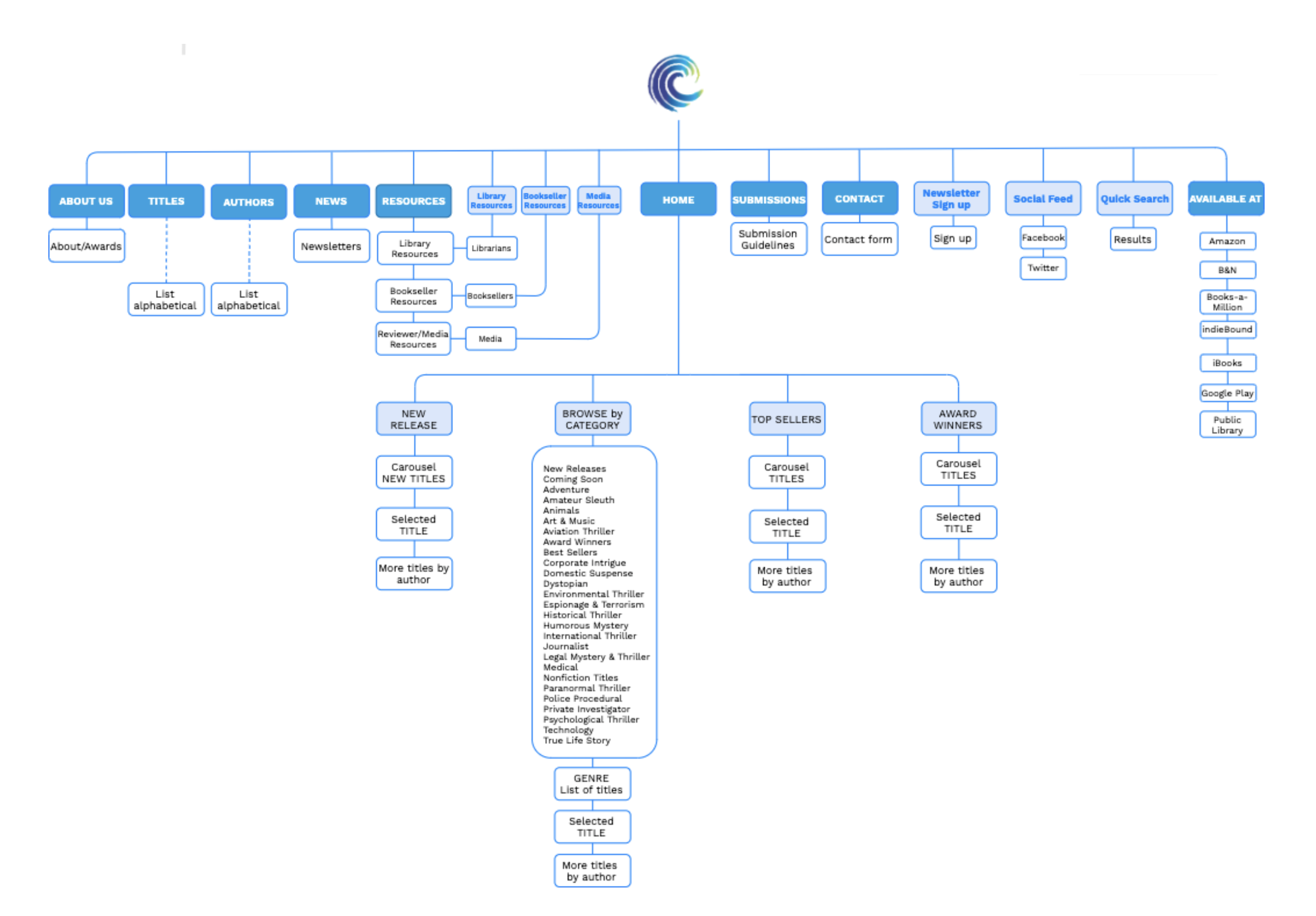
Before — Oceanview’s original site map had 15 categories and multiple redundancies
Simplifying a confusing and frustrating navigation
Not only were librarians unable to accomplish their task ⚠️ on Oceanview’s current website but found multiple parts of the process frustrating or annoying.
Pain points:
📍 Navigation was confusing and redundant; too many categories
🗺️ Information paths were not clear
🟦 Buttons were small and hard to find
🔥 Visual clutter
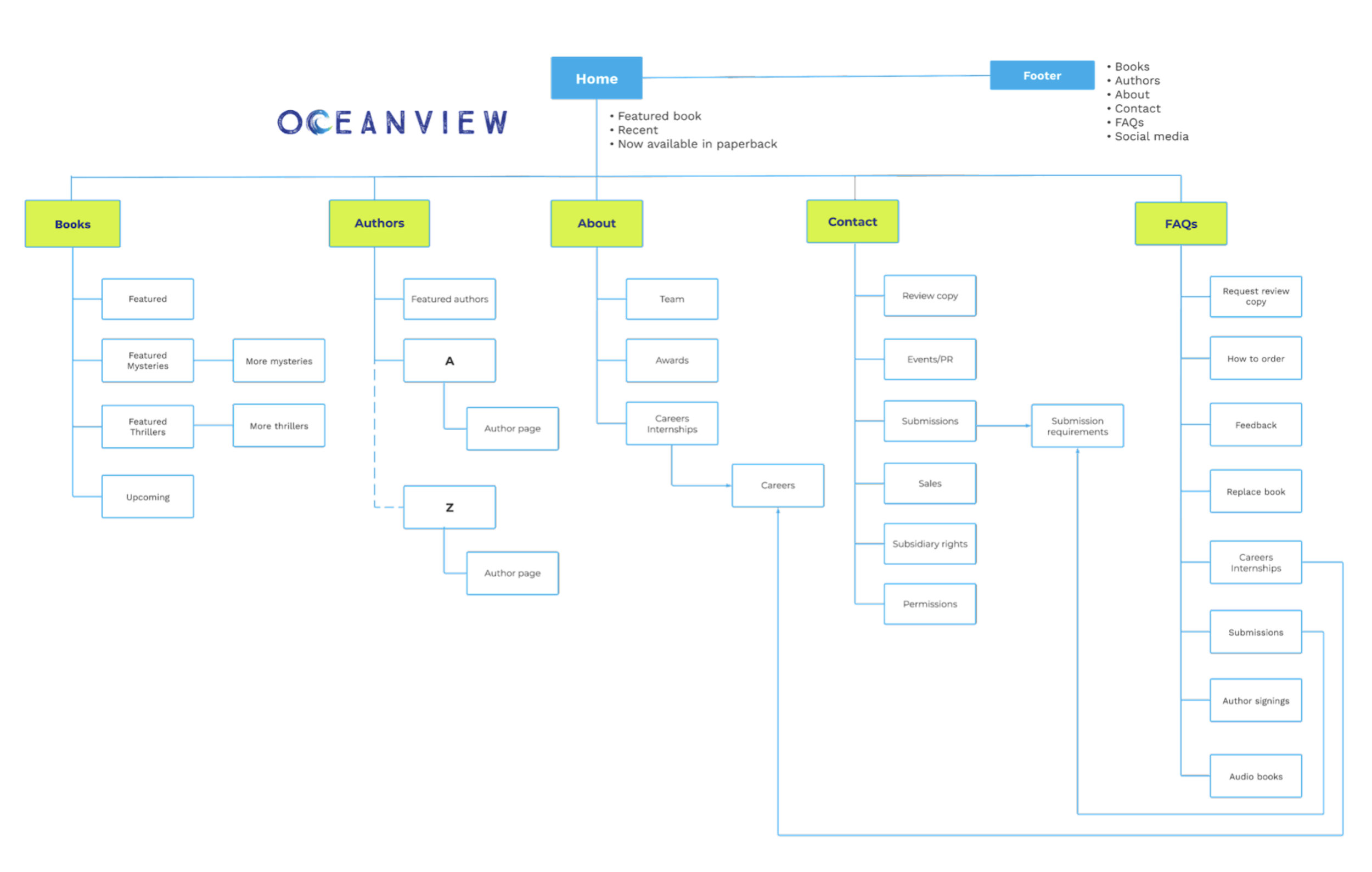
After — Site architecture simplified from 15 categories to 5 — further reduced to 4 after user testing
Analyzing the current site’s information architecture — and after running a quick Maze card sort test with a half dozen readers — we worked with stakeholders and staff to simplify the site map.
🔥 We reduced the original 15 categories down to 5
After user testing, this was later condensed to just 4 categories

Initial sketches (mobile and desktop)
Focusing design on key tasks
Don’t reinvent the wheel
Before jumping into design solutions, I conducted a visual analysis of competitor websites. Using Jacob’s Law — that users prefer your site to work the same way as all the other sites they already know — I collected the most common design patterns and visual elements from sites that had particularly direct solutions.
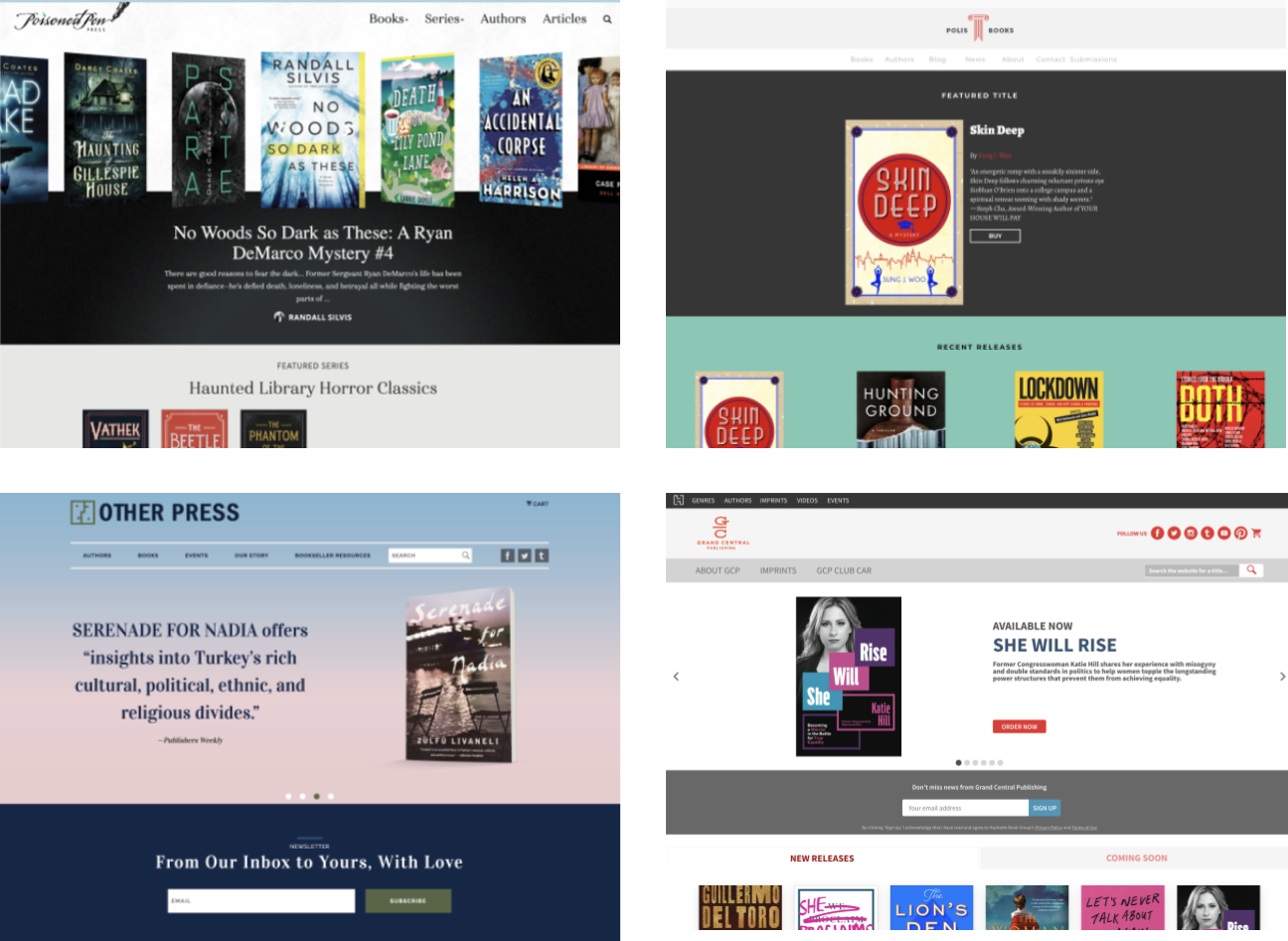
Some competitor websites we analyzed for design patterns
Sketching for key tasks
My first impulse as a designer is always to reach for 🖊️ markers and a sketch pad rather than jump in digitally. Brainstorming ideas and patterns collected from my visual analysis I quickly sketched page layouts, focusing on the most important key task:
⚠️ Making ISBN and publication information prominent and easy to find for librarians/booksellers

Initial sketches of key pages
Low-fidelity prototype (desktop)
Testing and iterating the design concept with librarians
After several rounds of design review with stakeholders, we settled on a set of wireframes.
Surprisingly, this early design would end up remaining significantly intact through a series of user testing and fidelities.
Using wireframes to map out a user flow, I created a simple low-fidelity prototype in Figma for both the desktop and mobile versions, so we could test out the design with some local librarians and booksellers.

Wireframes of key pages
Early results showed big gains in search and satisfaction…
We tested 🧪 the primary user flow to find publication information on a featured book title with about a dozen users using Maze.
⚠️ 🔥 Results indicated that just the small change of adding the publication information above the fold on book pages was enough to reduce the time needed for our librarians to complete their tasks by almost half
Satisfaction with the initial designs was quite high (89%)

Design changes following user-testing
…but also gave important design feedback
The usability study also pointed out a number of design issues we tackled moving to higher-fidelity mockups.
We added a search bar in the nav bar that somehow got forgotten (rookie error again!)
We further reduced navigation from five categories to four
We added a prominent CTA button to each featured book

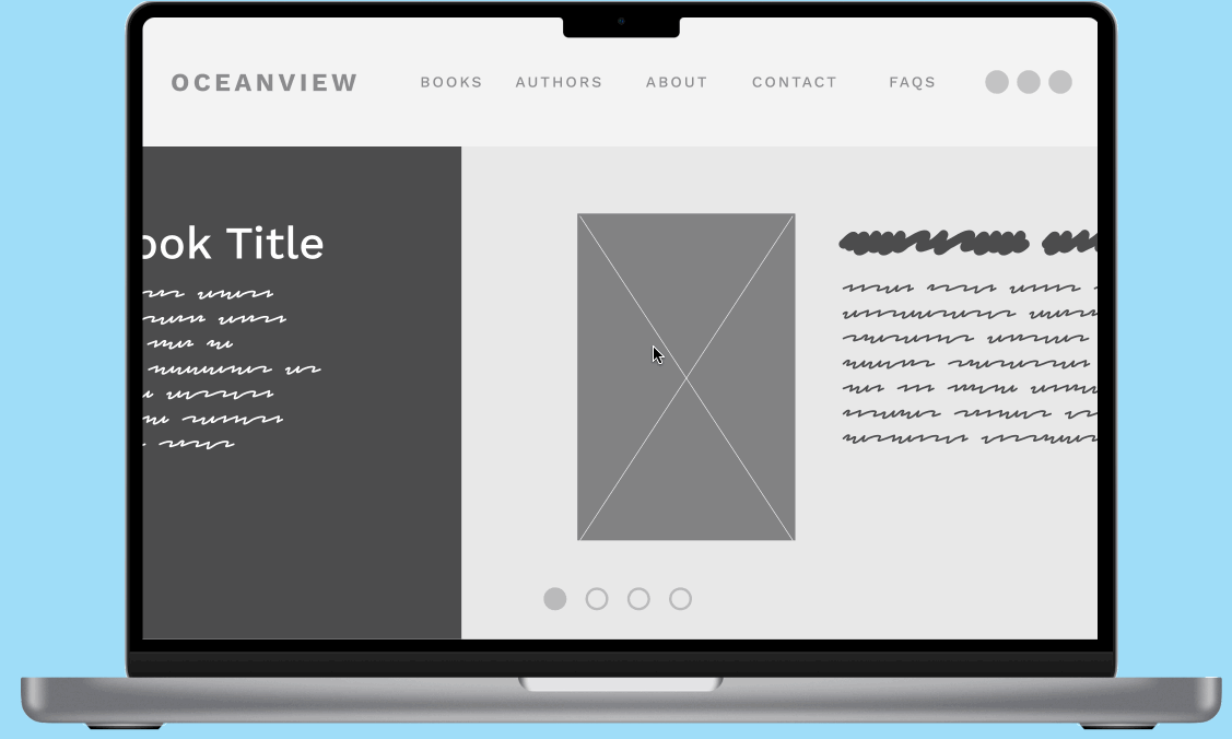
Final prototype (desktop)
Moving to high-fidelity, further testing and iterating
Mockups
Incorporating changes from the early user tests, we iterated on the low-fi design and re-tested our prototype. Once satisfied we had a successful design, we moved from the wireframes to first create high-fidelity mockups.

Final high-fidelity mockups
High-fidelity prototype
With a complete set of mockups in hand, we moved on to creating a high-fidelity prototype, both to test again and to demonstrate intended use interaction to the developers (whom we still hadn’t hired… another rookie error!)

High-fidelity prototype (mobile)
Validating our hypothesis — big improvement in search time
We compared the final prototype in a generic search to a timed test against the website at the time and found the new design would provide a 384% (!) improvement in search time.
We felt like we were ready to move to development with confidence.
⚠️ The reality was, though, I had overlooked some elements which, had I been working with an engineer earlier, probably would have been caught.
Creating an editorial-friendly Webflow experience
Now armed with high-fidelity prototypes on mobile and desktop that solved Oceanview’s search problem, we hired a developer to create a site in Webflow that would be easy for the editorial staff to maintain.
The previous CMS Oceanview used was difficult to manage for staff and required an on-call “IT expert'“. I persuaded stakeholders that a simpler, modern drag-and-drop solution like Webflow would simplify their work and be easier to use.
Working directly with the developer, a number of issues came up that required me to iterate the design on the fly.
Results — librarians thrilled, and nearly 50% gain in conversions
We met our three goals for the project and then some:
Librarians interviewed post-launch were enthusiastic about the new experience
“It’s so much easier to find titles now. Thank you!!”
— Central Florida acquisitions librarian
Initial analytics showed that conversions to bookseller sites, especially for popular audiobooks, jumped by nearly 🔥 half over the previous design
Testing showed the new website was 11% faster at search than the prototype
The visual refresh worked. Stakeholders and authors showed high satisfaction in a post-launch survey.
“The design looks fantastic!”
— Oceanview editor“Killer site!”
— Joe Clifford, longtime Oceanview author
Key takeaways
Rookie errors are great teachers
I made a few mistakes during this project — each one taught me something important I have learned from. For example, my first mistake was to assume we were designing a site for readers. But because I listened to our stakeholders, I was able to quickly pivot from that idea and head down the right path.
Keep users front and center
Human-centered design allowed us to engage and collaborate with our users from the start. Involving our key users — librarians and bulk buyers — in early stages of the process helped us avoid designing features solely from a business or technical standpoint.
Involve engineering early on
This was one rookie error that taught me a lot. Had we had developers onboard early on in the process, it’s likely we would’ve been able to eliminate or simplify some ideas early on and the process would have gone faster and smoother.
As it turned out, I ended up successfully collaborating with the developer on the fly and improving the design.
Tools used
Google Analytics (analysis)
Google Forms (surveys)
Google Sheets (interviews)
Google Slides (stakeholder presentations)
Zoom (interviews)
Figma (design)
Maze (user-testing)
Webflow (site development)